
Responsive menu for bootstrap
You can also be interested in:


This is a nice one.
Bootstrap is a nice framework, the great advantage of using it is that it saves you a lot of time while building a responsive web site (the same can be said of other css frameworks out there).
The drawback is that the web sites coming out in the last years very often looks the same, all of them have the same navbar and the same menu behavior which collapses for extra-small devices, showing a menu button which reveals the content when pressed.
A good way to differentiate your web site from the others could be a change in the menu collapsing behavior.
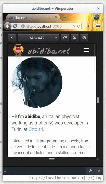
Datmenu is a nice responsive menu plugin for Wordpress, so the idea is to replicate its behavior and integrating it in a bootstrapped layout (navbar and menu). Like in the provided gif.
This is quite an easy job, if you know how css transitions work.
The leading actor here is the css property perspective, which gives an element a 3D-space by affecting the distance between the Z plane and the user. I recommend reading more about it in this post on css-tricks.
Then all we need is a bit of javascript and some css rules. I'll use the bootstrap less mixins for brevity. The great part of the javascript code is used to wrap all body contents inside two divs, you may cut such parts while wrapping directly your contents in the mentioned divs in your base template. I've done this in order to get the things working also when you simply can't touch the base template.
The idea is to wrap all the contents inside 2 divs, the external will get the perspective property, the inner one will be rotated and translated.
If you can't wait anymore, and wanna get the code, then surf here or go the end of the post; you need a js and a less file. There are two js files because you can choose your preferred library, mootools or jquery.
Now we'll analyze the js code to understand how to realize such behavior.
Javascript
- We need to bind a callback when clicking the menu button
jQuery(document).ready(function() { jQuery('button[data-toggle=collapse]').each(function(index, btn) { jQuery(btn).on('click', abidibo.menu.miniaturize); }); }) - In the callback we have to:
stop the event propagation: we need this because we'll add a click event to the wrapper container allowing to return to the original layout
get the target element: it is the content which was collapsed
calculate the viewport coordinates: these are necessary to fix the width and height of the container which will wrap all the site contents, to create a sort of screenshot. Even if we may use jQuery, it's better to use the window innerHeight and innerWidth properties, since the jQuery window.height() method doesn't work with ff mobile (on my phone).// stop propagation event.stopPropagation(); // target var target = jQuery(jQuery(this).attr('data-target')); // viewport coordinates var viewport_height = jQuery(window).height(); // it seems that translateX 100% takes into account the width of images inside // the document even if they have .img-responsive class, so we fix the width var viewport_width = jQuery(window).width(); - Wrap all contents inside two divs: #wrapper the outer and #main-container the inner. We also fix the height and width of #main-container using the previously calculated viewport dimensions
// wrap all body content inside two divs var wrapper = jQuery('<div/>', {id : 'wrapper'}); // main container height is fixed to viewport height var main_container = jQuery('<div/>', {id : 'main-container'}).css({ height: viewport_height + 'px', width: viewport_width + 'px', overflow: 'hidden' }); jQuery(document.body).children().wrapAll(main_container); jQuery(document.body).children().wrapAll(wrapper); - The animation is obtained through css3, as we'll see later, so we only need to add a different class to the body. Such operation is delayed because otherwise can happen that the animation fails, and the final state is reached immediately, probably because the animation affects the #main-container div which was created just now. Then we show the collapsed content (the menu) by cloning it and injecting it into the body
// add miniature class to body, the delay is necessary to get css3 animation setTimeout(function() { jQuery(document.body).addClass('miniature'); }, 100); // now show the collapsed content var content = target.clone().removeClass('collapse').appendTo(jQuery(document.body)); - Then we must define a way to go back. We add a click event to the #main-container div, so that when the user clicks it, all returns as it was before showing the menu. We have to:
stop the event propagation and prevent the default behavior: in fact we have to avoid the normal behavior if the user eventually clicks a link
create a reverse animation: this is done by setting an intermediate body class 'miniature-back'
remove the click event
remove the collapsed and cloned content
return to the original state: such operation is delayed in order to let the animation end. We have to unwrap all contents and remove the body class. That's it// drive me back! jQuery(document.body).on('click', '#main-container', function(evt) { evt.stopPropagation(); evt.preventDefault(); // update selector var var main_container = jQuery('#main-container'); // intermediate class to allow for css transitions jQuery(document.body).removeClass('miniature').addClass('miniature-back'); main_container.off('click'); content.remove(); setTimeout(function() { // remove wrappers main_container.unwrap(); main_container.children().unwrap(); jQuery(document.body).removeClass('miniature-back'); }, 1000); });
Css
Now the css (less using bootstrap mixins):
#main-container {
    .transition-transform(0.4s ease 0s);
}
.miniature {
    background-color: #222;
    #wrapper {
        .perspective(1500px);
        position: fixed;
    }
    #main-container {
        background-color: #fff;
        cursor: pointer;
        .transform-origin(50% 50% 0);
        .transition-transform(0.4s ease 0s);
        -webkit-transform: translateZ(-1500px) translateX(100%) rotateY(-45deg);
        transform: translateZ(-1500px) translateX(100%) rotateY(-45deg);
        .backface-visibility(hidden);
    }

    .navbar-collapse {
        position: absolute;
        top: 20px;
        left: 20px;
        box-shadow: 0 0 0 #222;
    }
}
.miniature-back {
    background-color: #222;
    #wrapper {
        .perspective(1500px);
    }
    #main-container {
        background-color: #fff;
        cursor: pointer;
        .transform-origin(50% 50% 0);
        .transition-transform(0.4s ease 0s);
        -webkit-transform: translateZ(0px) translateX(0%) rotateY(0deg);
        transform: translateZ(0px) translateX(0%) rotateY(0deg);
    }
}
The perspective property is assigned to the #wrapper div, then the inner container #main-container is translated in X and Z and rotated in the Y direction, so we get the "snapshot effect". You can change the animation interval by editing the 0.4s value of the trasition-transform mixin.
Since such collapsing behavior is normally fired with small devices, you can forget about older IE, and the css 3d transforms are well supported by mobile browsers.
You may want to add/change some styles for the .navbar-collapse class, which describes how your menu looks like when the site is miniaturized on the right side.
And now all the code together, powered by gist
You can test it by resizing this window (not anymore).
Hope you enjoy it! Hasta la proxima!
Your Smartwatch Loves Tasker!

Your Smartwatch Loves Tasker!
Featured
Django admin and bootstrap 5
Bootstrap 5 has come, currently in beta release, and seems already very stable.
So the question is: are you looking for ...

About code optimization, learn from exercises
Let's see an example of exercise you can face during a job interview, and let's use it to understand some ...

Notes on the Pearson correlation coefficient
The Pearson correlation coefficient is a measure of the linear correlation between two variables X and Y. It has a ...
Archive
- 2021
- 2020
- 2019
- 2018
- 2017
- Nov
- Oct
- Aug
- Jun
- Mar
- Feb
- 2016
- Oct
- Jun
- May
- Apr
- Mar
- Feb
- Jan
- 2015
- Nov
- Oct
- Aug
- Apr
- Mar
- Feb
- Jan
- 2014
- Sep
- Jul
- May
- Apr
- Mar
- Feb
- Jan
- 2013
- Nov
- Oct
- Sep
- Aug
- Jul
- Jun
- May
- Apr
- Mar
- Feb
- Jan
- 2012
- Dec
- Nov
- Oct
- Aug
- Jul
- Jun
- May
- Apr
- Jan
- 2011
- Dec
- Nov
- Oct
- Sep
- Aug
- Jul
- Jun
- May